From zero to launch
Demo article. The images are drawn from existing projects in this portfolio; the writing is placeholder editorial text used to test the long-form system.
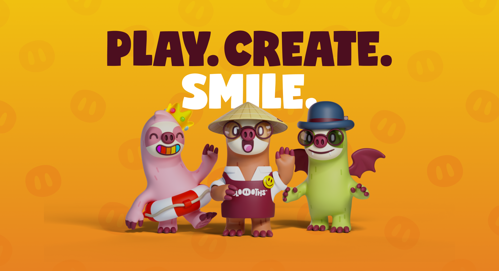
Most products do not begin as products. They begin as a rough idea about what should exist, held loosely enough that it can still change, and specific enough to be worth the trouble. Everything after that is the work of making it real without losing what made it interesting.
The distance between those two states is where most of the design happens, and very little of it looks like design while it is happening. It looks like arguments about scope, half-built screens, a name that does not fit yet, and a growing list of things that were obvious in the abstract and turn out to be undecided in practice.
What follows is a walk through that distance — not a methodology, and not a case study. Placeholder editorial text, illustrated with work already published in this portfolio, used here to test how a long piece holds together.
One caveat worth stating early: none of this is a process that runs the same way twice. The order below is roughly how the work tends to go, but real projects loop, stall, and occasionally start again from the middle. Treating any of it as a checklist is how teams end up with beautifully documented products nobody wanted.
Starting before the interface
The first useful question is rarely what it should look like. It is what the thing actually is, said plainly enough that someone else could repeat it back. A product that cannot be described in a sentence usually cannot be built in a straight line either.
That sentence does a lot of quiet work later. It decides what belongs in the first release and what does not. It settles arguments that would otherwise be settled by whoever is most confident in the room. And it gives the visual work something to be accountable to, which is the difference between a considered interface and an attractive one.
Getting to that sentence is harder than it sounds, because the first versions are always either too vague to be useful or too specific to be true. Somewhere between a category and a feature list there is a description that actually constrains things, and finding it is most of the early work.
It helps to write down what the product is not. Exclusions are easier to agree on than inclusions, and they tend to hold longer. A page of things this is not doing is worth more at week two than a roadmap.
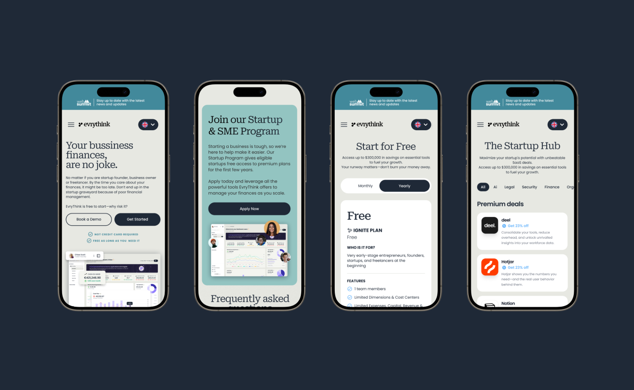
Interfaces are downstream of that decision. Once the shape of the thing is agreed, screens stop being inventions and start being consequences — which is a much faster way to work, and a much easier one to defend.
There is a practical benefit too. When the shape is clear, the interface can be sketched quickly and thrown away cheaply, because the sketches are testing an idea rather than carrying it. When the shape is unclear, every mockup quietly becomes a proposal about what the product is, and throwing it away feels expensive even when it should not.
Structure before surface
Structure is the part that survives redesigns. Navigation, hierarchy, the model underneath the screens, the words used for things — these outlast whatever the buttons look like this year, and they are much harder to change once people depend on them.
It is also the least glamorous stage, which is why it gets skipped. A product with a beautiful surface and no structure reads well in a portfolio and badly in use. The reverse is rarer and much more forgiving.
Naming is part of structure, and it is consistently underrated. What things are called inside the product becomes what they are called in support tickets, in the marketing site, and eventually in how people describe the product to each other. Change a name after launch and the cost is not the find-and-replace; it is every place the old word has already travelled.
The same applies to hierarchy. Where something sits tells people how important it is, and moving it later reads as a change of intent whether or not one was meant. These are the decisions worth slowing down for.
- What is the smallest complete version of this that someone could actually use?
- What has to be true on day one, and what can arrive later without breaking anything?
- Which decisions are expensive to reverse, and which are cheap?
Those three questions do most of the scoping. The last one matters most: expensive decisions deserve slow thinking, and cheap ones deserve none at all. Teams routinely get this backwards and spend their best hours on the reversible things.
Scope creep is rarely a single bad decision. It is a sequence of individually reasonable ones, each adding a little, none large enough to argue about. The defence is not discipline in the moment — it is having written the smallest complete version down somewhere, so the drift is visible against something fixed.
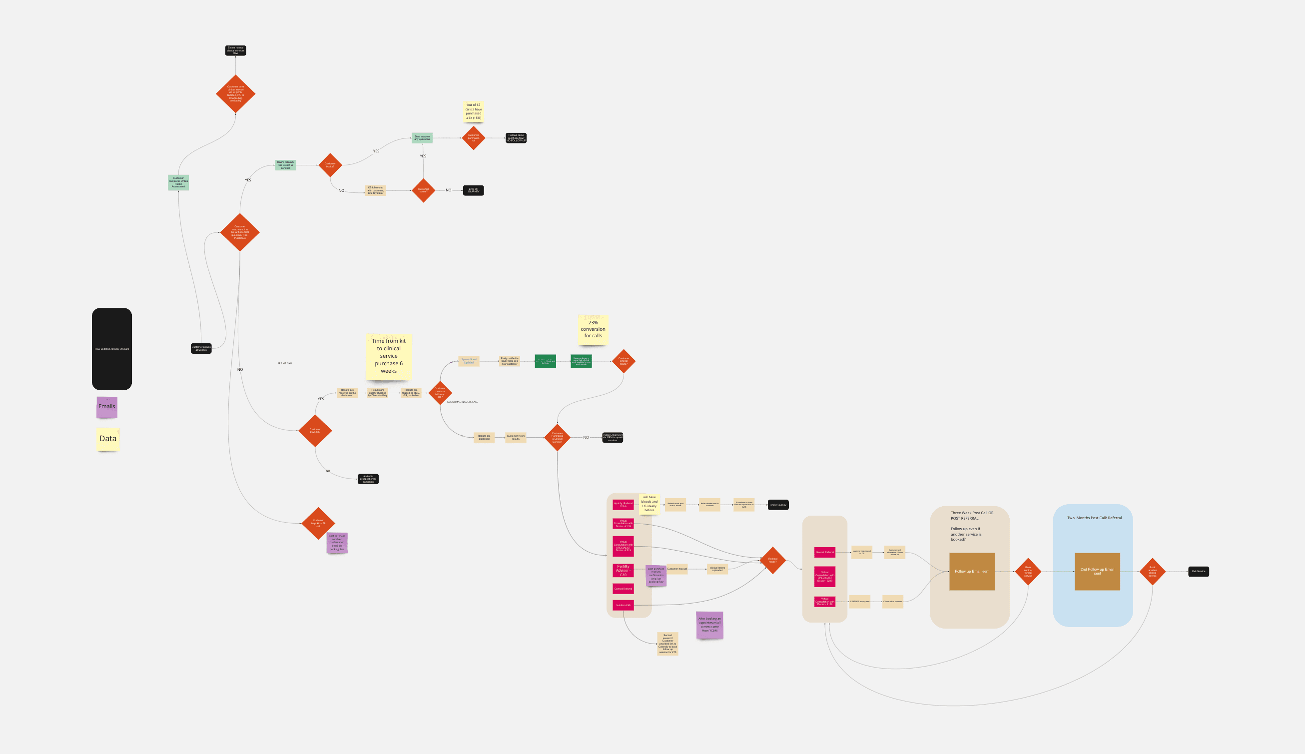
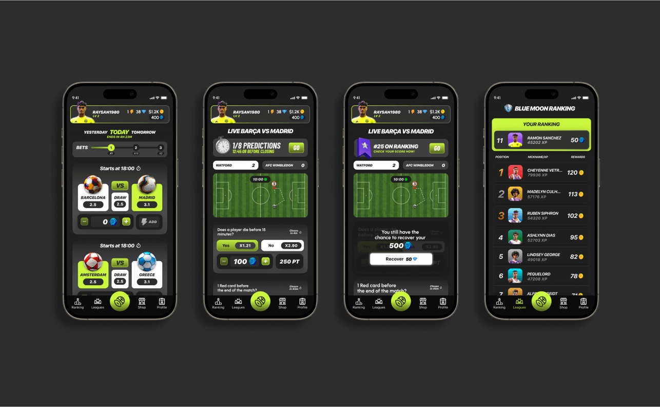
Flows are where structure becomes visible. A flow that needs explaining is usually a structural problem wearing an interface costume, and no amount of layout will fix it.
The useful test is to walk someone through the product without narrating. If they can get from the start to the point of the thing while you stay quiet, the structure is doing its job. If you find yourself explaining, note where — that is the map of what to fix, and it is usually shorter than expected.
Everything before launch is a guess. Everything after it is information.
Brand and product are the same problem
It is convenient to treat brand and product as separate disciplines with separate meetings. In practice they are the same decision viewed from two angles: what is this, and how does it behave. Split them and you get products that feel unrelated to the thing they are named after.
When they are made together, small things line up without effort. Tone matches the interface. Illustration is not decoration applied afterwards. The name, the language and the flows agree with each other, and the product is easier to explain — which is usually the first sign that it is easier to use.
Working the other way round is possible but expensive. A brand applied to a finished product can only adjust the surface, so it tends to get louder to compensate — more colour, more type, more personality bolted to screens that were designed without it. The result is a product wearing a costume.
This is more obvious with character work, where the brand is the product in a fairly literal sense, and any gap between the two is immediately visible.

Building it, not just drawing it
There is a point where drawing more screens stops producing information. The remaining questions are not design questions in any useful sense — they are questions about what happens when the data is real, the network is slow, the copy is longer than the mockup allowed, and someone does the thing nobody planned for.
The only reliable way to answer those is to build something and use it. Staying close to the build is not a preference; it is how the intent survives. Every handoff is a translation, and translations lose things.
This is where a lot of design work quietly changes shape. Instead of producing more artefacts, the job becomes making decisions quickly enough that the build does not stall, and being available when the build discovers something the design did not anticipate. Which it will, on roughly a daily basis.
Real content is the usual culprit. Names are longer, lists are emptier, images are the wrong shape, and the state nobody designed — the first-run, the error, the almost-empty — turns out to be the state most people see first.

Working this way changes what gets designed. Fewer states are invented speculatively, more are discovered. The result tends to be smaller than the original plan and considerably more finished, because the effort went into the parts that turned out to exist.
It also changes what gets argued about. Debates that could run for a week in the abstract get settled in an afternoon once there is something to open. Not because building makes people agree, but because it replaces opinions about what might happen with observations about what does.
Launch is a beginning
Launch feels like a finish line and behaves like a starting gun. It is the first point at which the assumptions get tested by people who were not in any of the meetings, and the first honest feedback the work has had.
The first week is mostly noise, and it is worth saying so in advance, because the temptation to react to every individual reaction is strong and almost always wrong. The signal arrives later, in the shape of what people do repeatedly rather than what they said once.

Which is the argument for getting there sooner with less. Not because speed is a virtue on its own, but because everything before launch is a guess, and everything after it is information.
And then it continues. The version that exists is a starting position, not a conclusion, and most of what makes a product good happens in the unglamorous stretch afterwards — the corrections, the removals, the small repairs that never make it into a case study but are the entire difference between something that launched and something that lasts.