Interface decisions that age well
Demo article. The writing is placeholder editorial copy and the imagery is existing project work from this portfolio, used to test the long-form reading experience.
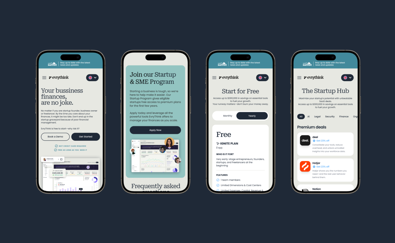
Every interface is a set of decisions wearing a visual costume. Change the costume and most people notice immediately. Change the decisions and, if the work was good, almost nobody notices at all — which is exactly the problem with judging interface work by how it looks on the day it ships.
Some choices survive three redesigns. Others are quietly deleted before the next quarter. The difference is rarely craft in the obvious sense; plenty of beautiful screens get thrown away. It is usually whether the decision was about the product or about the surface.
The interface is not the product
It is tempting to treat the interface as the thing being designed. It is closer to the visible edge of something larger: a model of what exists, what it is called, what can be done to it and in what order. The screen is where that model becomes touchable, but it is not where the model is decided.
Which is why interfaces built without an agreed model tend to sprawl. Each new requirement arrives as another control, another tab, another modal, because there is nothing underneath to say where it belongs. The interface grows to accommodate confusion that was never resolved.
You can usually spot it in the language people use in reviews. When the model is clear, the conversation is about whether something is right. When it is not, the conversation is about whether something is confusing — which is the same question asked from further away, and much harder to answer.
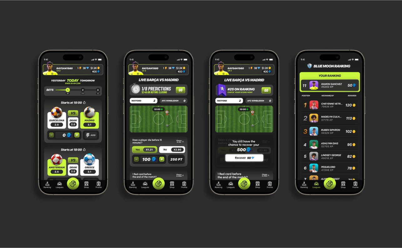
The reverse is quieter and harder to photograph. When the model is settled, screens get simpler over time rather than more complex, because new requirements have somewhere obvious to live. Nothing about that reads as impressive in a portfolio. It just works for longer.
Design for the second version
A useful discipline is to design as though the current version is already the old one. Not defensively, and not by building for imagined requirements, but by asking a narrow question: if this doubles in scope, what breaks first?
The answers are usually structural. A navigation that assumes five items. A card that assumes a short title. A layout that only holds together because today's content happens to be the right length. None of those are visible problems at launch, and all of them are expensive later.
This is not the same as building for scale that may never arrive. Designing a system for a hundred thousand items when there are nine is its own kind of waste. The question is narrower: which assumptions are load-bearing, and how quietly will they fail?
- What happens when this list is empty, and when it has two hundred entries?
- What happens when the name is three times longer than the placeholder?
- What happens when someone arrives here from somewhere unexpected?
These are the boring questions, and they are the ones that decide whether the work survives. You can read more of the same thinking in deciding what not to build, which covers the same ground from the product side.
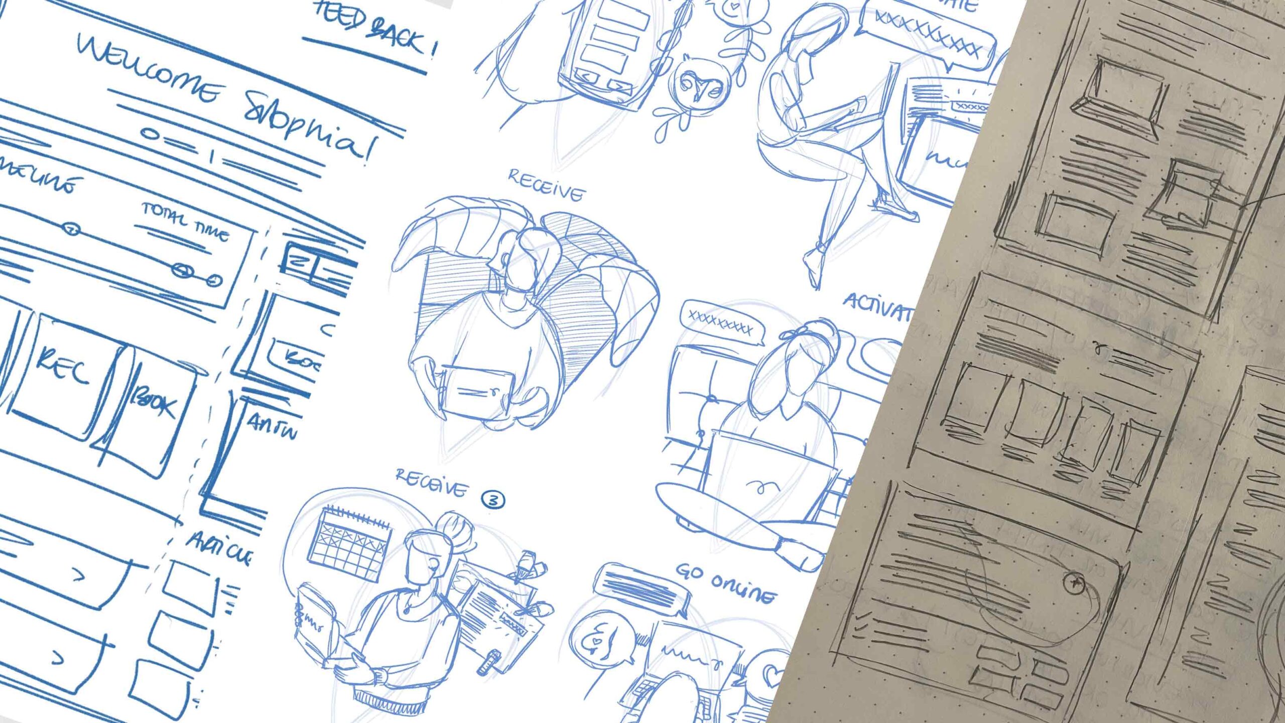
Names become infrastructure
The words inside an interface get treated as copy and behave like architecture. What something is called sets expectations about what it does, where it lives and how important it is. Those expectations then leak outward into documentation, support conversations and how people describe the product to each other.
Renaming after launch is rarely a find-and-replace. The old word has already travelled. Someone has written it into a help article, a colleague has used it in a meeting, and a customer has built a mental model around it. The cost is not the change; it is everywhere the change does not reach.
There is a related trap in naming things after how they were built rather than what they do. Internal vocabulary leaks into interfaces constantly, and it is invisible to the team because everyone already knows what it means. To everyone else it reads as a product that was not written for them.
Which argues for spending disproportionate time on naming early, when it is still cheap, and for writing the words down before drawing the screens. The related note on naming goes further into this.
The best interface decisions are often the ones nobody notices after six months.
Consistency before novelty
Novelty is easy to justify in a review and hard to justify a year later. A new interaction pattern has to earn its cost: the explaining, the edge cases, the second implementation someone writes because they did not know the first one existed.
Consistency is not the same as sameness. It means a person can predict what will happen from what they have already learned. When that holds, the product feels smaller than it is, which is usually the goal. When it breaks, every screen becomes something to be read carefully.
Most of that predictability comes from a small number of decisions repeated well: where actions live, how destructive things are confirmed, what feedback looks like, how errors are phrased. Get those consistent and a surprising amount of the rest can vary without anyone feeling lost.
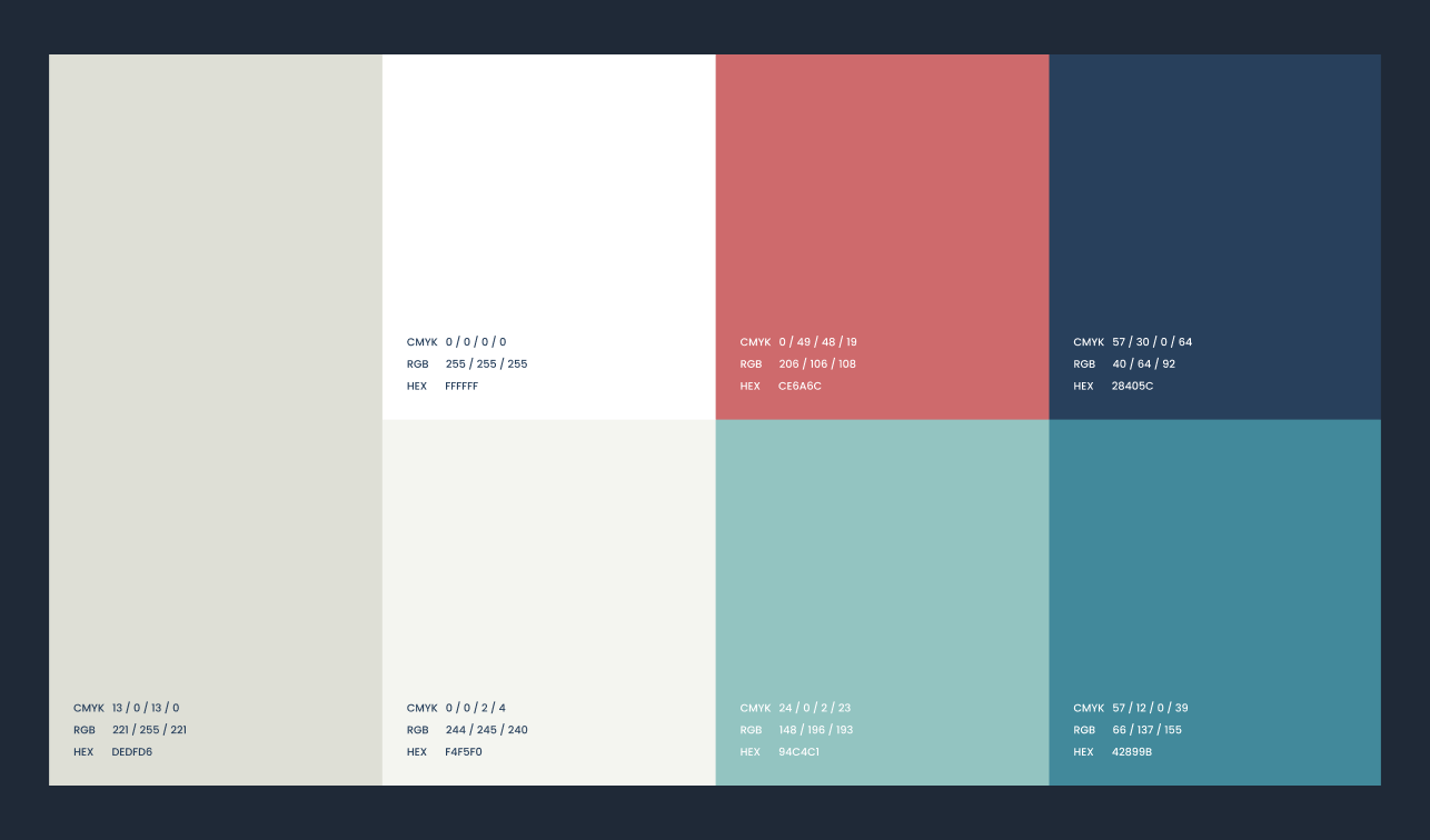
The exception is worth naming: sometimes the established pattern is genuinely wrong for the problem, and matching it would be consistency for its own sake. The test is whether the difference is doing work, or whether it is just newer.
Removing more than you add
Most interfaces accumulate. Controls arrive because a decision was uncertain and showing both options felt safer than choosing. Over time the screen becomes a record of unresolved arguments.
Removing is harder than adding because the cost of adding is spread across everyone later, while the cost of removing lands on whoever proposes it. But an interface that has never had anything taken out of it is almost certainly carrying decisions nobody would make again.
It helps to separate two questions that usually get asked together: is anyone using this, and is anyone relying on it? Plenty of things are used occasionally and matter enormously when they are. Plenty of others are used constantly out of habit and would not be missed.
What survives
The decisions that last tend to share a quality: they were about what the thing is, not what it looks like this year. Structure, naming, hierarchy, the order of steps, what is shown by default. Visual treatment sits on top of all of that and can be replaced without disturbing it.
That is not an argument against visual craft. It is an argument for knowing which layer a decision belongs to, and giving the slower layer the slower thinking. The longer piece on building from zero to launch covers how this plays out across a whole project.
In practice the two layers are not cleanly separable, and pretending otherwise produces work that is structurally sound and lifeless. The point is sequencing rather than hierarchy: decide what the thing is, then make it feel like something, and expect the second to occasionally send you back to the first.
Six months after a redesign, the parts people talk about are almost never the parts that took longest. The parts that took longest are the reason nobody is talking about anything else.